Designing for Color not just Blindness
Designing for colorblindness is important as 8% of people have it. But there are many other reasons color might be hard to see so good design should be baked in from the start. A colorblind "mode" shouldn't be tacked on as an afterthought. There are several tools and techniques to help make designs better for everyone, colorblind included.
I read a great post by a colorblind designer detailing his experiences, design techniques and examples. I hope to follow on from that with my own research as a non-colorblind designer.
This is another research post for a project I've been working on with the University of Hertfordshire, which aims to be used by people with a range of disabilities.
What is Colorblindness?
A large proportion of men, about 8%, are colorblind. Web designers often test website usability in browsers with just a few percent market-share, but do they test their site is usable by colorblind people? Due to genetics only about 0.5% of women have some form of colorblindness, but with 1 in 200 it's still likely that a colorblind woman could visit your site and very likely a colorblind man will.
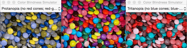
The name is a misnomer as colorblind people can still see color, but a limited range "able to correctly identify 5 out of 24 colored pencils". The most common form is red/green (deuteranopia and protanopia) but there are other forms across the spectrum. Any colours containing red or green components (e.g. purple) will be seen without that component, resulting in a shade of brown or yellow. Search for more deuteranopia comparison images to see what it's like.
Why Does it Matter?
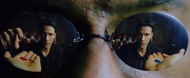
Colorblindness is not linked to poor eyesight and as many many as 40% of colorblind students don't even realise they have it; so a lot of the time it doesn't matter. But if color alone is used to distinguish between important items or states then there could be a problem. I like to think that someone working on "The Matrix" film was colorblind because Neo was presented with red or blue pills—imagine if they'd been red or green and he'd taken the wrong one! In the real world there are many examples that use color as an indicator. Here are some for red:
- Danger / Warning / Hot
- Stop signs / traffic lights
- Error indicators
- Validation and mistakes
- Marking (green pen / red pen)
- Luck (China)
- Sales (shops)
- Electronics (red=standby, green=on)
As if 8.5% colorblind people isn't enough, there are other reasons people might struggle to see color—making it even more essential to design with color deficiency in mind:
- Greyscale (laser) printouts of your website / design.
- Black & White screens (Kindle EInk, old laptops, low power devices)
- Poorly calibrated screens shifting color.
- Dodgy VGA cables (I've seen the odd screen in an office with a heavy tint)
- Failing projector bulbs (often leave a strong yellow tint)
- Bright sunlight on projector screen (washes out color)
- Cheap TN LCD screens viewed from an angle (colors shift completely)
That's several scenarios off the top of my head where color might be impaired when viewing your design. If you've got important choices in your design such as "delete" / "save" buttons be sure to use more than just color to distinguish between them.
Design Testing Tools
You don't have to be colorblind to test how your design will be perceived. Use a colorblindness simulation app to alter your screen's colors. In a pinch on Mac or iPhone you can make the screen greyscale via Accessibility Settings; overkill for testing colorblindness but still useful for the situations where your design might be seen in greyscale.
 On the flip side I found an app (Red Stripe) for colorblind people that adds stripes to red items, helping them to distinguish between red / green when it would otherwise be unclear. It can be used on poorly designed graphs (e.g. green profit / red loss) or even live on the real world with a smartphone camera. I think this is amazing and it touches my heart, imagining someone "seeing" a new color for the first time, being able to tell that berries are a different to the leaves. I present it here as a thinking point, and to suggest situations where using pattern (e.g. stripes) in a design as well as color would be beneficial.
While you're at it, test for other vision impairment too by blurring your design. Not only will this help you to make the design more legible, but it indicates which areas of your design stand out most (often it's not the bits you think). Spur is a nice free webapp that performs 7 perception simulation tests on your design, so it's incredibly useful for both accessibility and perception testing. An quick alternative is to simply squint or look at your design from a distance.
Importance of Research and Testing
Traffic lights are an example of a worldwide safety device where a large proportion of users can't recognise one of its indicators. Colorblind drivers may not be able to tell the red light from green, but they can of course still tell the position—top is stop. With safety devices, however, the more indicators there are the better as accidents can happen in a split second. If shape or symbol were used as an indicator too, would that help?
In researching I saw a suggestion to use a symbol stencil over the bulb as an extra indicator. However from past experience I know that small details disappear when blurred (poor eyesight, fog, distance) and a mockup confirmed this. I thought that shaping the whole bulb would be more visible. I saw that suggested too, with triangle used for the red stop light but triangles are usually used for yellow warning signs so for consistency it would be better to use that for the yellow light and a hexagon for the red as that's often used for stop signs. I mocked that up and tested it too, only to discover that when blurred a hexagon ends up looking like a circle. Only the triangle was clearly distinct. This was the case for both blur and motion blur as you might get while driving. The last images have a deuteranopia simulation effect showing the lack of distinction between colors.
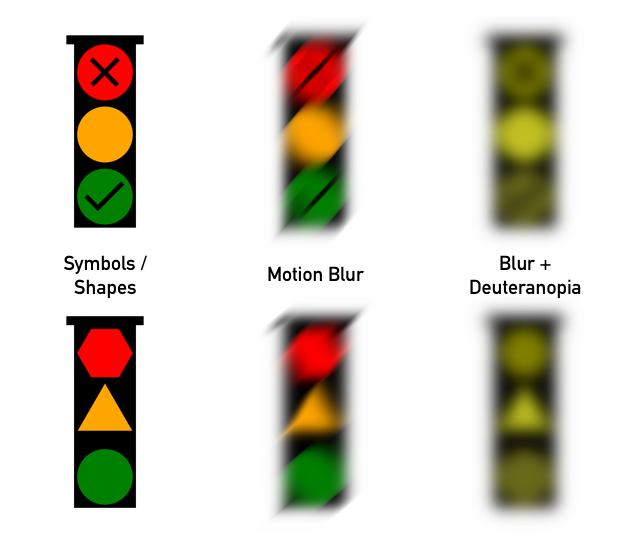
This example illustrates the importance of testing designs. My intuition told me to use a hexagon, which turned out to be wrong in testing. Design is about solving problems so we need to test if we have succeeded. For traffic lights a lot more real world testing would need to be done, but for non safety critical web design we can make do with simulation tools.
Designing for Distinction
While choosing colorblind friendly colors is a good start, it's ideal to use other indicators too for ease of distinguishing between choices. The Web Content Accessibility Guidelines are always a good place to start, and key to this they specify using high contrast and require that "Color is not used as the only visual means of conveying information". Lets try an example. We have two buttons with very different purposes that we want to be sure are easily distinguished.
Here they look very similar, only the words themselves to distinguish. Muscle memory is your enemy here—Windows users are used to the affirmative action being on the left, whereas it's reversed on Mac and Linux. We can fix the ordering, see my post on Sniffux, but short of doing that we'll start with improving the text. Adding an exclamation mark to "Delete" indicates danger. We also increase the spacing between them to reduce accidental presses—helping users with motor control problems.
Now differentiate the colors (choosing so they can also be differentiated by colorblind people).
We can change the shape, to make the dangerous option pointy while the safe option is rounded and friendly.
And we could add a stripe pattern evoking the cross through many "No XYZ" signs.
Finally even adding symbols and changing font weight.
 As I was leaving the room I glanced over and saw that the final design really does stand apart and is much clearer than the others. However I'm not suggesting you differentiate this much—it would get ugly and visually confusing—these are just examples of what can be done. For non-critical distinctions just a couple of differentiators is fine, use more at your discretion based on the scenario. It's not difficult though, all of the above are a simple
 <a class="XYZ">Button Text</a> tag styled only with CSS.
Design Methodologies
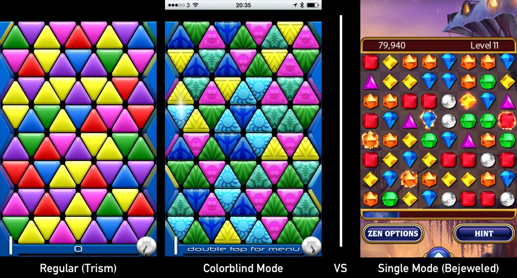
Two different approaches to designing for colorblindness can be seen in the games Trism and Bejeweled. Both are tile matching games.
Trism has a regular mode and a separate colorblind mode. In regular mode color is the only way to distinguish between tiles. This is a poor choice as it can lead to mistakes. The colorblind mode uses a different color palette which is easier for colorblind people to see, but I also find it easier as a normally sighted person so I wonder why this isn't the default and only palette. This mode also adds patterns to tiles making them easier to distinguish, as even with the adjusted palette it's hard to make 6 colors distinguishable to a colorblind person (I can only easily make out 5 using a simulator, but still better than the 3 / 4 I can make out in regular mode). It doesn't change the shapes, but Trism relies on triangles nestling and sliding so this is fine.
Bejeweled doesn't have a separate colorblind mode, yet the tiles are still easily distinguishable. This is because they both have different shapes and patterns (though the patterns are all fairly similar shiny jewel patterns). For colors, Bejeweled fares similarly to Trism with me being able to easily make out 4 / 5, though there are 7 total which is 1 more than trism.
From my research I found that colorblind people can accurately pick out maybe 5 colored pencils out of a set, and these 2 games seem to hit that limit. Using white and black would give you two extra, so I think Bejeweled could be further optimized. Another differentiator for Bejeweled could be animation with gems rotating in different directions. This may cause distraction, headaches or even motion sickness so must be tested—design decisions can never be considered in isolation.
The difference in design methodology is interesting. Trism has a separate colorblind mode whereas Bejeweled has a single well designed mode using 3 distinguishing characteristics. I prefer the 1 design approach if possible as it's less work to start and when adding features, and nobody feels left out or segmented. Furthermore a colorblind mode might be hard to find and potential users could be put off if it's not the default.
Conclusion
I think simulated tritanopia actually looks quite beautiful with its shades of blue and pink, so it is possible to create colorblind friendly designs that look great. Remember there is plenty of beauty in the world to be seen even in just black and white.
Use freely available tools to test your designs so they'll look good for the widest range of users possible. Use distinguishable colors, distinct variations in brightness & saturation, and shapes & text alongside the colors of your design. It might not be necessary to create a separate mode, often careful planing and bit of final tweaking will lead to a good design for all users.