Designing User Interfaces for Hemispatial Neglect
 Hemispatial neglect, also known as unilateral / spatial / side neglect, is a neuropsychological condition causing a lack of awareness and attention to one side of the body. This may make the patient act oblivious to one side of space, such as reading only one side of text on a website. I could find no information on design or UX for hemispatial neglect, so the ideas in this post could be breaking new ground.
For a high proportion of patients the condition becomes chronic, so it's important that resources for stroke sufferers be designed to mitigate the effects of spatial neglect. This post focusses on designing to improve accessibility for patients with perception loss and motor control impairment caused by hemispatial neglect.
This is another research post for a project I've been working on with the University of Hertfordshire, which aims to be used by people with a range of disabilities—especially stroke patients.
Hemispatial Neglect
Stroke is the most common cause of hemispatial neglect when one hemisphere of the brain is damaged. It is the opposite side of space to the damaged hemisphere that is neglected, and usually the neglect side is the left. Hemispatial neglect affects up to 200,000 stroke survivors in the US but is rarely diagnosed.
Hemispatial neglect causes patients to completely ignore, or feel the affected side is unimportant. While loss of sensory function and vision can also be caused by stroke, this is separate to spatial neglect. A patient can still see, hear, feel, and move on the affected side but their brains don't process the information to recognise or understand that area of their world. This leads to examples such as not recognising their own limbs; only dressing one half of themselves (single sleeve / sock / glove); eating half a plate of food; reading just half of a web page; and even ignoring that side of dreams and memories.
I find hemispatial neglect a truly fascinating condition. It can be treatable, but for patients where it becomes chronic we could design to make living with their condition easier.
Mitigation with Design
I found no research, articles, or guidelines on designing around the effects of hemispatial neglect. I propose hypothetical ways to improve the readability and usability of web sites for patients. I have incorporated some of these techniques into a prototype rehabilitation web application for the University of Hertfordshire. In the future they may carry out clinical testing to asses the effectiveness of the techniques.
In some following examples I use "lorem ipsum" placeholder copy. It is not intended to be read or understood, it's just filler to illustrate the design.
Margins and Alignment
In my research I read that a patient may miss half of the text on a page when reading. Logically, it seems the text on the page should be positioned to the opposite side of their neglect so that it can be perceived.
Text justification should never be used as web browsers don't use a hyphenation algorithm to split long words, resulting in often large gaps between words on some lines. Justified text is also harder to read due to the uneven spacings.
The only alignment that should be used for blocks of text is left aligned. In the western world we read left to right, so this is the most readable alignment. In trying to mitigate the effects of side neglect we don't want to make reading harder in general.
For shorter pieces of text such as headings the alignment could be changed to suit the neglect. Align text right for a left neglect and left for a right neglect—pushing text away from the deficit areas.
Standard alignment
This is a standard layout representative of many pages on the Internet.
Lipsum
Proin blandit tortor at bibendum scelerisque. Aliquam commodo consequat augue. Donec sit amet magna nec lectus mattis euismod quis sit amet sem. Donec aliquam blandit nunc, id tempus diam tempor ut. Nam at sollicitudin ex. Fusce consectetur eleifend porttitor. Duis at euismod augue. Pellentesque ut magna nisl. In tristique nisi nec dapibus pretium.
Left side neglect alignment
Using a large left-margin moves content out of the patient's neglect zone.
The main text is still aligned to the left, but the short title is aligned to the right (out of the neglect zone). I have added a line to guide the eye towards the heading so that it doesn't get lost in the ragged right edge.
Lipsum
Proin blandit tortor at bibendum scelerisque. Aliquam commodo consequat augue. Donec sit amet magna nec lectus mattis euismod quis sit amet sem. Donec aliquam blandit nunc, id tempus diam tempor ut. Nam at sollicitudin ex. Fusce consectetur eleifend porttitor. Duis at euismod augue. Pellentesque ut magna nisl. In tristique nisi nec dapibus pretium.
Right side neglect alignment
Lipsum
Ut ultricies vestibulum urna, at tempor tellus facilisis et. Quisque malesuada, risus quis vehicula luctus, felis nibh sodales arcu, id vestibulum quam odio nec dolor. Quisque eleifend laoreet dolor vel ornare. Sed maximus id odio id elementum. Aliquam at magna metus. Nullam nec turpis volutpat, malesuada est at, laoreet enim.
I won't be showing the right side neglect variant going forward as it is just the reversal of the more common left neglect version.
Layout
On a larger scale, the whole page can be shuffled around to move less important items out of the prime attention area, leaving space for the main content.
Standard layout
Lipsum
Left side neglect layout
The less important sidebar is moved to the left while the margin and alignment techniques are used to mover the main content right.
Lipsum
Buttons
It's important to get the usability of interface elements like buttons correct as if a navigational button can't be recognised then the whole site becomes unusable. Adding an "dead weight" icon and using the margin technique could make buttons more usable by neglect patients.
Standard buttons
Left side neglect buttons
An icon is added to the neglect side of the button, pushing the text over to the attentive area. This assumes the patient has good reading ability, otherwise the text and icon positions should be reversed.
If space allows, put each button on a separate line so they can each be as far away from the neglect side as possible.
Full Example
Standard page
Left side neglect page
Important items biassed to the right, less important items (edit button) moved to the left (neglect side).
Rehabilitation with Design
This is an exciting prospect, but unproven. Presented here are ideas for how design could be used to not only make it easier for a patient to consume content, but also to assist in their rehabilitation.
For recovering stroke survivors it is often recommended to approach and place items on the neglected side. It may seem mean at first but encouraging use of the neglected side is the main way to effect recovery.
A balance would have to be made between helping the patient to see the content as in the above section, and encouraging recovery by deliberately placing items on the neglect side. Ideally the most important items would be placed on the aware side, then supplementary items can be placed on the neglect side using techniques that prompt the user to look there.
All of the following examples assume the most common left side neglect.
Arrows and Gazing
Studies have shown that people tend to follow the gaze of others, even in photos. This is also true for following arrows, especially when hand drawn. The same effect could be leveraged in stroke patients to encourage them to look over to their neglected side.
Here the cat is gazing and arrow pointing left, along with a call to action “look”. The mouse is gazing forwards to try and hold the patient's own gaze on their neglect size to strengthen it.

![Rasbak [GFDL (http://www.gnu.org/copyleft/fdl.html) or CC-BY-SA-3.0 (http://creativecommons.org/licenses/by-sa/3.0/)], via Wikimedia Commons](images/designing-user-interfaces-for-hemispatial-neglect_cat.jpg)
This type of layout could be used in rehabilitation games.
Animation
Movement is eye-catching so animated supplementary items relating to the main content can be placed on the neglect side. Hopefully the movement would encourage the patient to look over, with the relation to the main content cementing a link between left and right in the mind.
Here a gently rotating teapot both attracts the patient's gaze and shows them how to perform the therapeutic action. The animation is slow and smooth being careful not to overly distract, cause motion sickness, or seizures (WCAG).
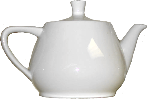
Pour Tea
To pour tea, focus on gripping the handle tightly, then... Donec efficitur semper molestie. In in magna molestie, congue enim nec, blandit sem. Sed lacinia est sit amet felis imperdiet eleifend. Suspendisse potenti.
This type of layout could be used for patient information pages, to both inform and rehabilitate. It could also be used for recreational content—multimedia rehabilitation books with animated pictures supporting the text.
Swapping and Emphasis
Moving or swapping content from the strong side to the neglected side could cause the brain to switch focus side.
Notice in this example 5 techniques have been used: Swapping switches the patient's attention side. Animation guides the focus. Arrows promote directional gazing. Color emphasis on the moving arrows and remote increases focus. Friendly call to action tells the patient what to do.
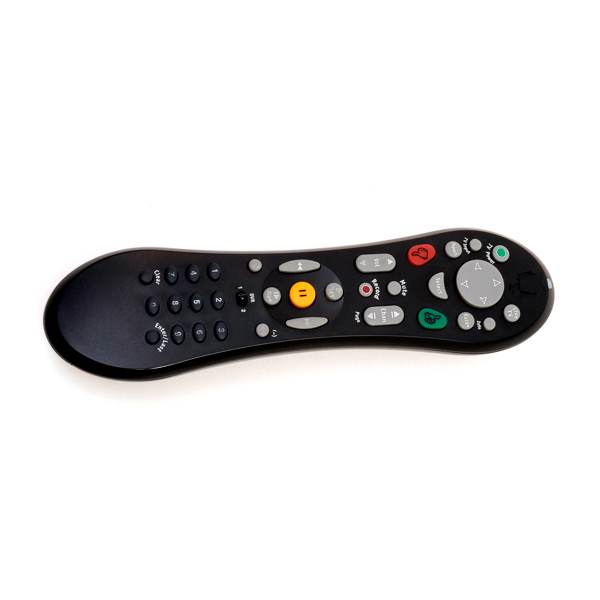
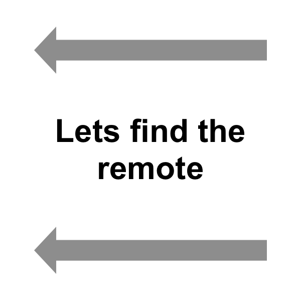
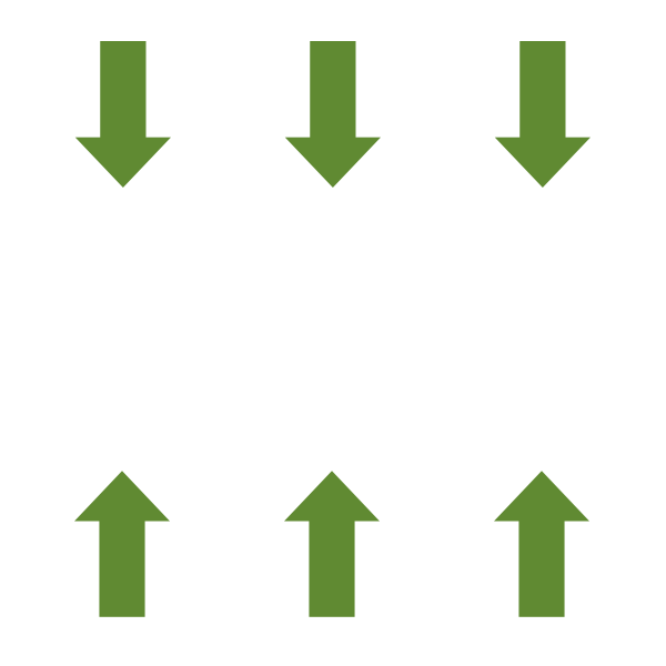
This type of layout could be used for patient rehabilitation pages.
Use Cases
These techniques could be used in various digital materials for rehabilitating, assisting, and entertaining stroke survivors.
- Informational pages would give the patient tips for living with their condition that double as treatment exercises.
- Games would be an interactive way for clinicians to get stats on patients' recovery.
- Recreational pages may be specially written books or reformatted news articles to keep patients entertained and feeling connected while unobtrusively rehabilitating them.
Conclusion
This post itself is an example of designing for the most common left side neglect. The main content is biassed over to the right, and headings are right aligned. It is responsive too; you can drag your browser window smaller or view the post on a smart-phone.
While hemispatial neglect isn't fully understood, research is promising and treatments are being discovered. Research into designing around the condition is sparse but I have presented some suggestions for techniques that may help.
Further, it may even be possible to use design as a tool in helping to rehabilitate sufferers. This is an exciting prospect, and none of this—to my knowledge—has been done before.