Bootstrap Web Content Accessibility
I've been working on a University of Hertfordshire project which aims to be used by people with a range of disabilities. There are a set of standards for this called the Web Content Accessibility Guidelines (WCAG). Version 1 was introduced in 1999 and version 2 in 2008. As these guidelines are a W3C standard and have been around for a long time I hope designers are aware of and try to follow them whenever possible.
WCAG 2.0 "covers a wide range of recommendations for making Web content more accessible. Following these guidelines will make content accessible to a wider range of people with disabilities, including blindness and low vision, deafness and hearing loss, learning disabilities, cognitive limitations, limited movement, speech disabilities, photosensitivity and combinations of these. Following these guidelines will also often make your Web content more usable to users in general." So it helps to increase accessibility for people with disabilities, and will make content more usable by general users too.
The previous developers of the project I'm working on chose Bootstrap as a CSS framework. The choice was likely made because it is extremely popular (82,109 stars on GitHub at time of writing) and provides a consistent styling foundation for web applications.
Bootstrap and WCAG
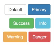 Due to its popularity and number of designers contributing to it I expected Bootstrap to be accessible. There is a line in their contributing guidelines "When feasible, default color palettes should comply with WCAG color contrast guidelines" which is good to see. Alas Bootstrap doesn't always meet the specification. I looked at the buttons section and immediately thought that the colors seemed hard to read. Using Colour Contrast Analyser to check, sure enough most of the default Bootstrap button colours failed the test (several on all levels). Searching the issues list I found 31 mentioning "WCAG", some resulting in an improvement being made to Bootstrap's accessibility, others sadly put form over function "We won't be merging this in. I'm not against ensuring there is proper contrast, but this doesn't look that good."
Design to me is about balancing art with constraints. Without an element of artistry it isn't design, it's drafting. The constraints can be wide and varied, and it is hard to find the perfect balance between constraints and artistry. Accessibility is an important constraint for the web, and at times Bootstrap chooses artistry over that, but there are other areas where Bootstrap is very accessible.
I think it would be useful for a design framework to put artistry aside and focus on accessibility. This way a designer would start with a solid (albeit potentially unattractive) foundation that they can add their own artistry to using judgement based on a project's specific needs.
Conclusion
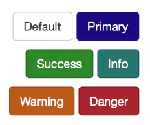 For this project I've overridden and fixed several areas of Bootstrap where color contrast wasn't high enough. I've also made changes that wouldn't be applicable to most projects, such as increasing font sizes and bolding text. I suggest designers follow WCAG where possible as it benefits all. The color contrast guidelines are especially easy to follow using Colour Contrast Analyser. It's actually quite addictive check color combinations that look suspicious in projects. Finally, don't blindly trust tools just because they're popular, do your own research and make sure they meet your project's needs before using them.